CSS
Cascading Style Sheets
Download Demo
To download the demo code for this lecture, run the following:
$ hbget css --demo
Our Goals
Learn basics of modern CSS
Agenda
What is CSS good for?
CSS syntax
Common selectors, properties & values
Intro to flexbox
Order of precedence in CSS
Separating Content from Presentation
Writing HTML was horrible before CSS because you couldn’t separate your content from your presentation.
Without CSS:
<font color="red">
  <p>Make this paragraph red.</p>
  <p>And this one, too.</p>
</font>
With CSS:
p {
   color: red;
}
<p>All paragraphs are now red!</p>
CSS also lets us give meaning to certain styles.
Why did we want those paragraphs red?
.overdue {
   color: red;
}
<p class="overdue">
  Your homework is late!
</p>
Basic CSS Syntax
CSS is made up of selectors, properties, and values.
selector {
    property: value;
}
In our example, we’re selecting all <p> elements and styling them.
p {
    color: red;
}
In CSS, comments are delineated by /* and */, like this:
p {
    color: red;   /* our brand color */
}
Where Do You Write CSS?
Inline Styling
You can write CSS in the body of HTML documents, within element tags
This CSS applies to only that individual element. Selectors are not used
Not used for the majority of styling, only when needed for special cases
<button style="color: blue; font-size: 12px"> Click Me </button>
Internal CSS
CSS can also go inside a
<style> </style>tag in the head of HTML documentsThis CSS applies to the whole page
Convenient for small amounts of CSS, or when learning
<!doctype html>
<html>
  <head>
    <style>

      /* CSS goes here */
      p {
          color: red;
      }

    </style>
  </head>
  <body>

    <!-- HTML goes here -->
    <p>Some text</p>

  </body>
</html>
Separate CSS Files
Usually, best practice is to put CSS in separate file and link to it from HTML
These files are called stylesheets
This is helpful if CSS is for more than one page, or if you have a lot of CSS
We can put into a separate .css file:
selector {
    property: value;
}

selector {
    property: value;
    another-property: value;
}

/* ... */
Add link element in our HTML:
<html>
<head>

  <link rel="stylesheet"
        href="/static/css/style.css">

</head>
<body>

  <!-- ... -->

</body>
</html>
Selectors
Selectors say “which HTML elements do we want to style?”
selector {
    property: value;
}
Tag Names as Selectors
Use a tag-name if you want to target all elements of a certain type.
h1 {
    font-family: sans-serif;
}
<h1>My Sans Serif Heading</h1>
IDs as Selectors
Use an #id if you want to selectively target one element.
#slogan {
    font-family: monospace;
}
<p id="slogan">
  Buy melons from us.
</p>
Classes as Selectors
If we need to create a group of elements that aren’t of the same type, we can give them all the same
classattributeThen use a
.classto target elements by class:
.urgent {
    color: red;
}
<p class="urgent">
  Your melon order has shipped!
</p>
To put two classes on one element:
include each, space separated,
in quotes.
.urgent {
    color: red;
}

.outlined {
    border: 2px solid black;
}
<p class="urgent outlined">
  Your melon order has shipped!
</p>
Combining Selectors
Can combine element and class, or element and ID:
/* select all paras that are urgent */

p.urgent {
    color: red;
}
<p class="urgent">
  This is an urgent paragraph!
</p>
This is an urgent paragraph!
Descendant Selector
p b {
    color: red;
}
<p>
  My favorite book is <b>Python 101</b>.
</p>
This means “bold elements anywhere descended from a paragraph (i.e. anywhere inside a paragraph).”
“Descended”
By “descended”, this means “inside a paragraph to any depth”.
For example, consider the following HTML:
<p>
  My favorite book is
  <span><b>Python 101</b></span>.
</p>
Now, the bold element isn’t directly inside the paragraph — the span element is. However, when you simply have a space between two items in your selector, it means “any level of descendant”, so this will find the bold items deeper inside this paragraph.
Can use with more complex selectors:
/* select all "urgent" descended from para */

p .urgent {
    color: red;
}
<p>
  This is a regular paragraph that has an
  <span class="urgent">urgent</span>
  section within it.
</p>
This is a regular paragraph that has an urgent
section within it.
Contrast to earlier “combining”:
/* select all paras that are urgent */

p.urgent {
    color: red;
}
<p>This is a paragraph.</p>

<p class="urgent">
  This is an urgent paragraph!
</p>
This is a paragraph.

This is an urgent paragraph!
Properties
“Properties” are the things you can set (color, font, etc):
selector {
    property: value;
}
Text and Font Properties
Text Properties
text-align (left/center/right justify)
text-decoration (underline style)
line-height (height of text lines)
Font Properties
color (font color, not background color)
font-family (font name)
font-size
font-style (italics or normal)
font-weight (light, bold, etc)
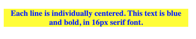
div {
  text-align: center;
  color: blue;
  font-weight: bold;
  font-family: serif;
  font-size: 16px;
  background-color: yellow;
}
Background Properties
You can set background colors:
body {
    background-color: green;
}
Or background images:
body {
    background-image: url("/static/img/bg-image.jpg");
}
The Box Model
In CSS, the “box model” refers to a box that wraps around every element
margin: The white space that separates one element from another
border: Border around content (and padding, if any)
padding: The buffer space between the content of an element and its border
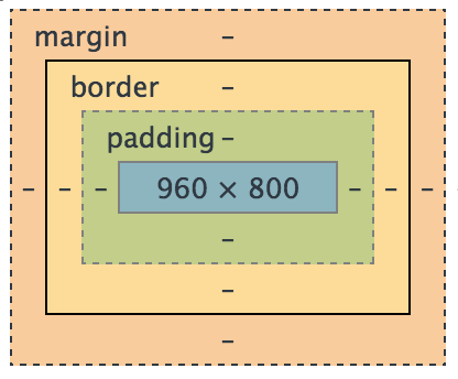
The width and height properties determine the size of an element’s content area.
But the full size of an element on the page includes the margin, border, and padding.
This div will have a total width of 350 px:
#my-div {
  width: 320px;
  padding: 10px;
  border: 5px solid gray;
  margin: 0;
}
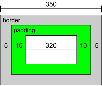
320 px (width) + 5 px (left border) + 5 px (right border)
+ 10 px (left padding) + 10 px (right padding) = 350 px.
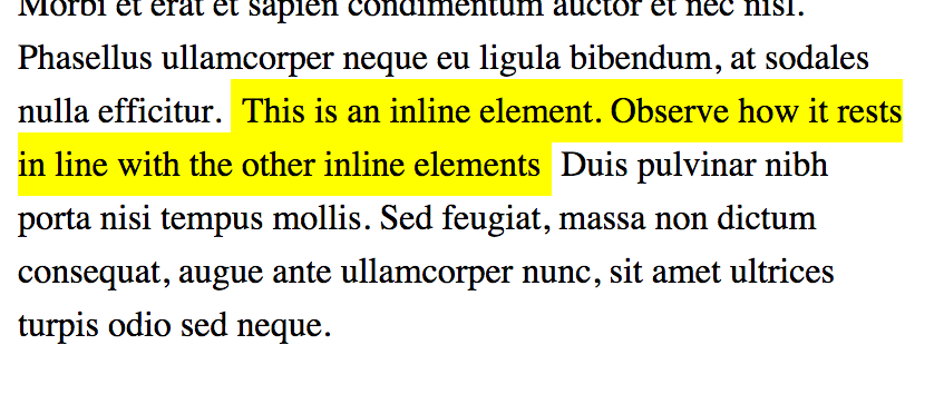
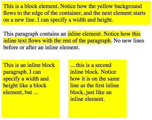
Block / Inline
Block Elements
start on a new line
take up the whole width of their containing element
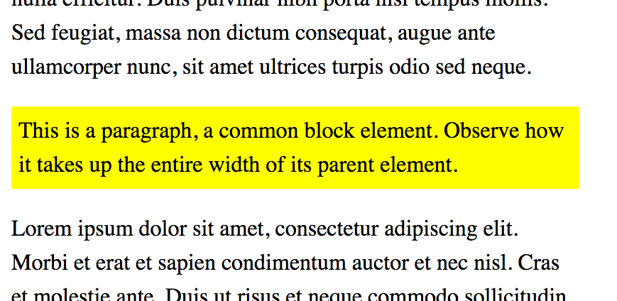
Inline Elements
sit on a line together
don’t break the flow of document
Displays: Block and Inline
display: blockdisplay as blockdisplay: inlinedisplay as inlinedisplay: inline-blockdisplay as block that flows with the surrounding content
Values
selector {
    property: value;
}
Units for Numeric Values
pixels (px)
Correspond to dot on screen.
Best for things that are always the same size:
image heights/widths
border thicknesses
.boxed {
    border: solid 1px black;
}

#site-logo {
    height: 50px;
    width: 50px;
}
percentages (%)
Percentage of an element’s “containing block” (usually the parent element if it is a block element like a div)
Best for making things “relative”:
This item is 50% as wide as its parent
form {
    width: 50%;   /* half as wide as page */
}
Other Numeric Units
- ems (
em): Width of letter “M” in font. Good for making things relative to text size.
- viewport height (
vh): Relative to 1% of height of the viewport (screen). Can be useful for pages that scroll.
Notes about Numeric Units
Zero values shouldn’t have a unit:
body {
    margin: 0px;       /* bad!  */
    margin: 0;         /* good! */
}
Decimal values should have a leading zero:
footer {
    margin: .75em;   /* bad!  */
    margin: 0.75em;  /* good! */
}
This isn’t required by the specification, but is considered very
good style, as it’s easy to misread .75em as 75em, and
the leading zero makes it much harder to misread. This is a good
practice to follow in any language.
Color Values
Referencing colors can be done in three primary ways:
color name
hex value
red-green-blue value
p {
    color: red;            /* or */
    color: #ff0000;        /* or */
    color: rgb(255, 0, 0);
}
Hex values are typically 6 hex (0-9, a-f) digits. There first 2 digits say how much red is in a color; the second how much green; the third, how much blue.
Hex values can also be given with only three digits, like #abc,
which always means the same things as #aabbcc.
Transparency
You can also learn about the rgba() method of specifying a color,
where you can provide an “alpha” channel value that shows how
opaque or transparent the color is.
Shorthand Values
Border shorthand:
.outlined {
     border-width: 2px;
     border-style: solid;
     border-color: black;
}
.outlined {
     border: 2px solid black;
}
You should especially use the shorthand for border, as border-style is required for the border to even be visible. The shorthand makes it harder to forget this important piece.
Different margins:
div {
    margin-top: 10px;        /* the top margin is 10px  */
    margin-right: 2px;      /* the right margin is 2px  */
    margin-bottom: 5px;     /* the bottom margin is 5px  */
    margin-left: 2px;       /* the left margin is 2px  */
}
Same margin all around:
div {
    margin: 2px;              /* all have 2px margin */
}
More margin shorthands
div {
    margin: 5px 2px;          /* top/bottom=5px | right/left=2px */
}

div {
    margin: 2px 4px 6px 8px;  /* top | right | bottom | left  */
}

A good mnemonic for the order of top |rarr| right |rarr| bottom |rarr| left
in things like this is "trouble" for TRBL. Others may find it easy to remember
as "start at the top and go clockwise."
Flexbox
Powerful way to arrange contents of elements, or center child elements
display: flexmust be set on parent element
.flex-container {
  /* initialize flexbox */
  display: flex;

  /* properties to arrange child elements */
  flex-direction: row;
  flex-wrap: wrap;
  justify-content: center;
  align-items: center;
}
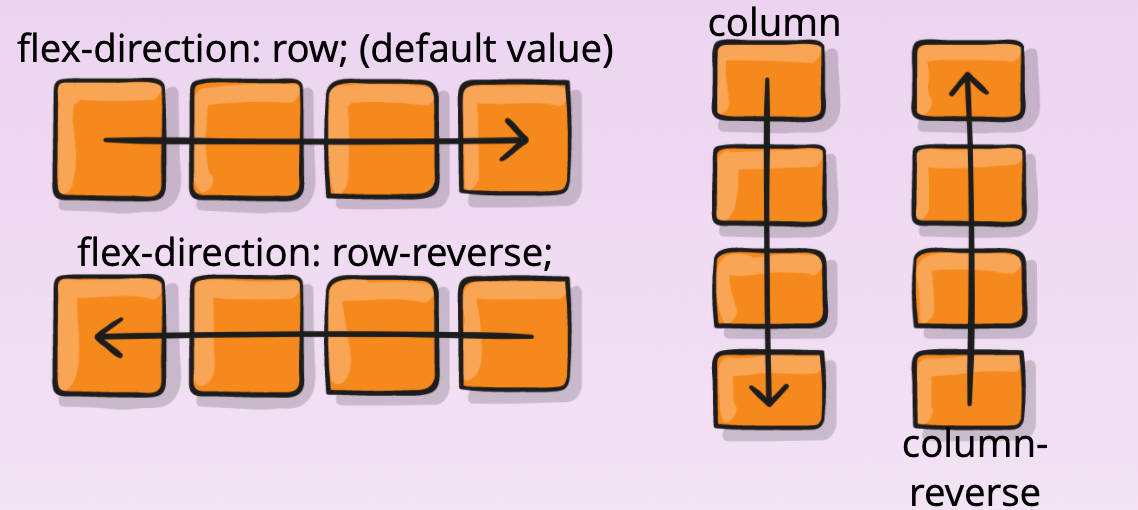
flex-direction
The default value is row, which will arrange the contents horizontally, even if they’re block elements!
flex-wrap
This property determines whether elements should wrap in the parent or not
The default value is no-wrap
To have them wrap, set
flex-wrap: wrap
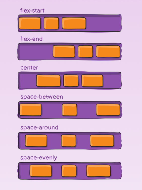
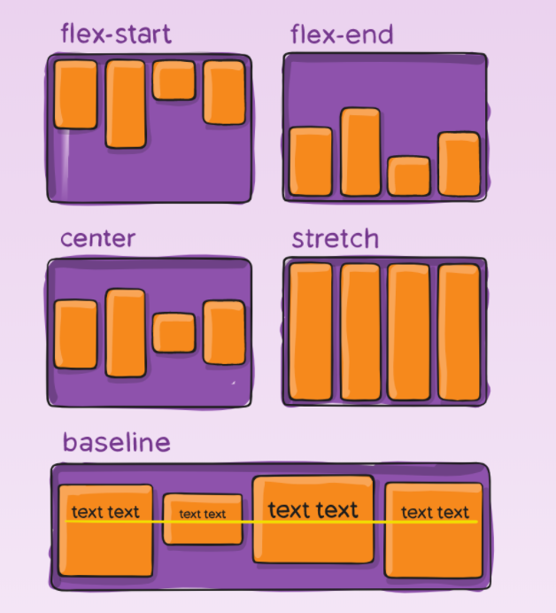
justify-content
Determines horizontal position and spacing of child elements when the direction is row
Determines vertical position and spacing of child elements when the direction is column
Default value is flex-start
align-items
Determines vertical position and spacing of child elements when the direction is row
Determines horizontal position and spacing of child elements when the direction is column
Default value is flex-start
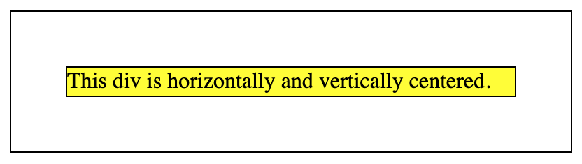
Centering Using Flexbox
div {
  border: 1px solid black;
}

.flex-container {
  display: flex;
  height: 150px;
  width: 600px;
  justify-content: center; /* center horizontally */
  align-items: center; /* center vertically */
}

#child-div {
  width: 80%;
  height: 20%;
}
Multiple Rules
No Conflict
p {
    color: blue;
}

.red {
    background-color: red;
}
<p>I am a blue paragraph.</p>

<p class="red">Blue on red background</p>
Last One Wins
p {
  color: gray;
}

p {
  color: blue;
}

.red {
    background-color: red;
}

.green {
    background-color: green;
}
<p>Paragraph is blue</p>

<div class="red green">Background is green</div>
Last one wins.
In general, “last one wins” — however, see below for where this changes when the “specificity” is different. This “last one wins” considers all CSS to be in one big virtual file — so even if you included this in two different tags, like:
<style> ... </style>
<style> ... </style>
or, two different stylesheets:
<link rel="stylesheet" href="one.css">
<link rel="stylesheet" href="two.css">
That’s all considered by your browser as one big pile of CSS, even though it came from multiple sources.
Most Specific Beats That
#form-error-message { color: red }

.urgent { color: orange; }

p { color: blue; }
<p class="urgent" id="form-error-message">
  What color will this be?
</p>
The last rule, “last one wins”, applies when selectors are of the same specificity. Here, the specificity of our selectors changes, so even though we wrote the rule that would turn the text blue last, class selectors are more specific than tag-name selectors, and id selectors are more specific than either, so the text color will be red.
Looking Ahead
Coming Up
css-trials exercise
Bootstrap Introduction
Making Your Site Pretty
Resources!
Further Study
More background properties: background-size, background-position, background-repeat
3 Simple Tips for HTML and CSS to improve Keyboard Accessibility [article]
Advanced Reading: The Book of CSS [book]